
Hi, I am Akane, a UI/UX designer at Kurashiru’s search team.
This time I would like to talk about how our search team uses the UX mapping methods to organise, identify and prioritise our tasks from the product’s perspective by using “User story mapping”.
1. To identify the users’ goals. At this step, we will decide what’s our user’s goals.
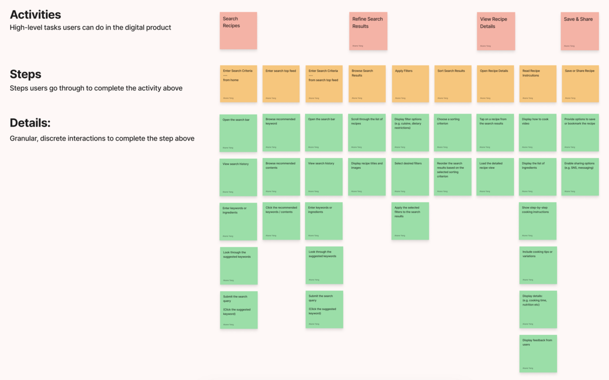
2. Map users’ activities.
List out key Activities, Steps and Details that are involved in the search function.
By viewing the mapping, our team members could have a clear vision of each key activity, and follow up with steps users take during each activity and details.
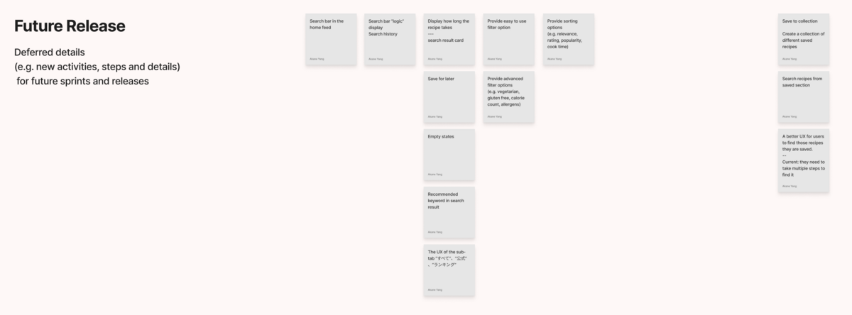
3. Organise tasks for future release We have summarised all tasks that are possible to get improved for feature releases from left to right.
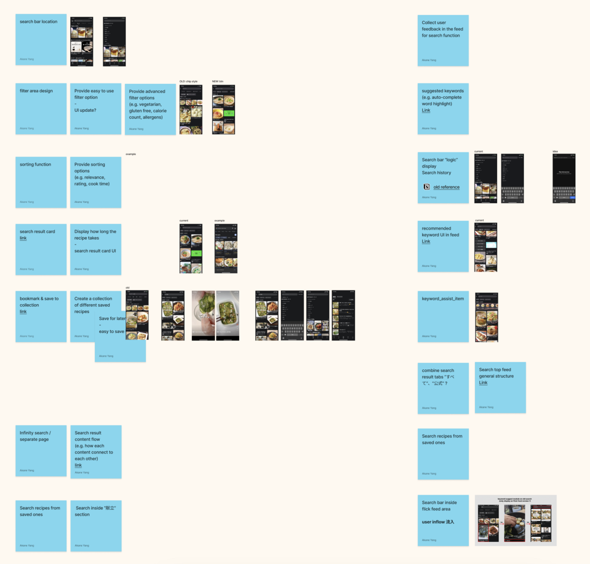
Before discussing with PdM, I listed each potential task along with current screenshots as well as some detailed notes that could help us to visualise tasks.
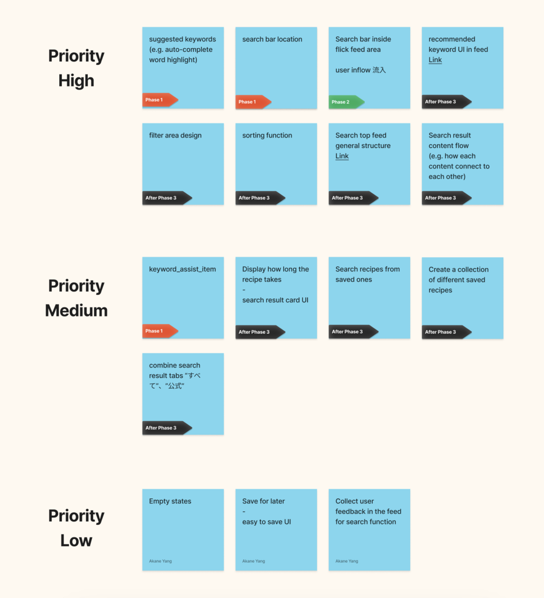
After discussing this mapping with PdM, we “finalised” tasks by each phase and priority. Because we are using Figjam’s sticker function, it is very easy for us to adjust the priority of each task, remove un-needed ones and add new ones as well.
Here is an example of how we bring an “easy-to-use” search experience to our users. Before discussing with PdM, I will write down which area I would like to improve (WHAT), the reason (WHY), and how I plan to do it (HOW.) Here is the summary of why we decided to add the search bar to the home screen.
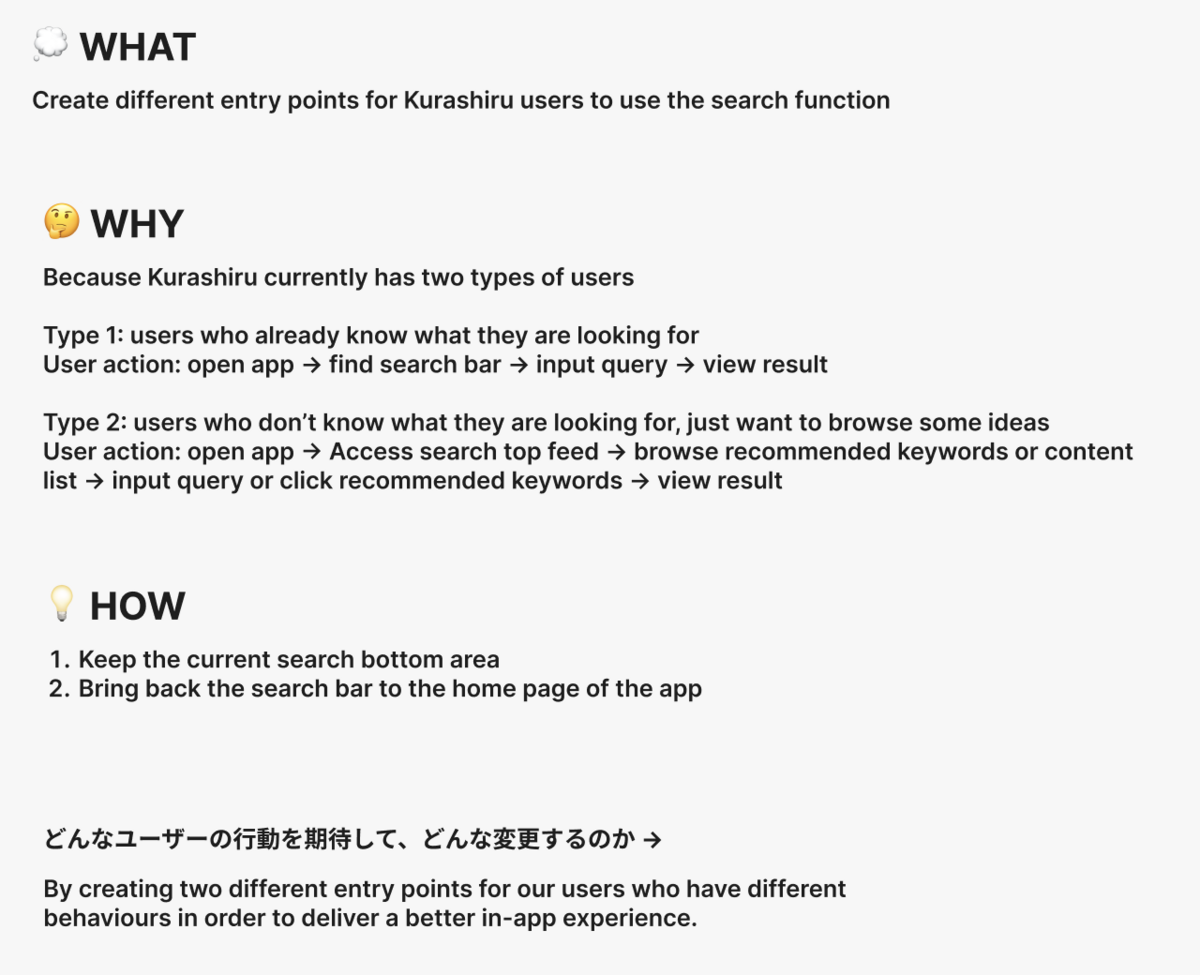
Kurashiru currently has two types of users:
Type 1: users who already know what they are looking for (search for ingredients that they already have in the fridge or at home, shopping before) User action: open app → input query from the home search bar → view result Most of Kurashiru's loyalty users are in this category.
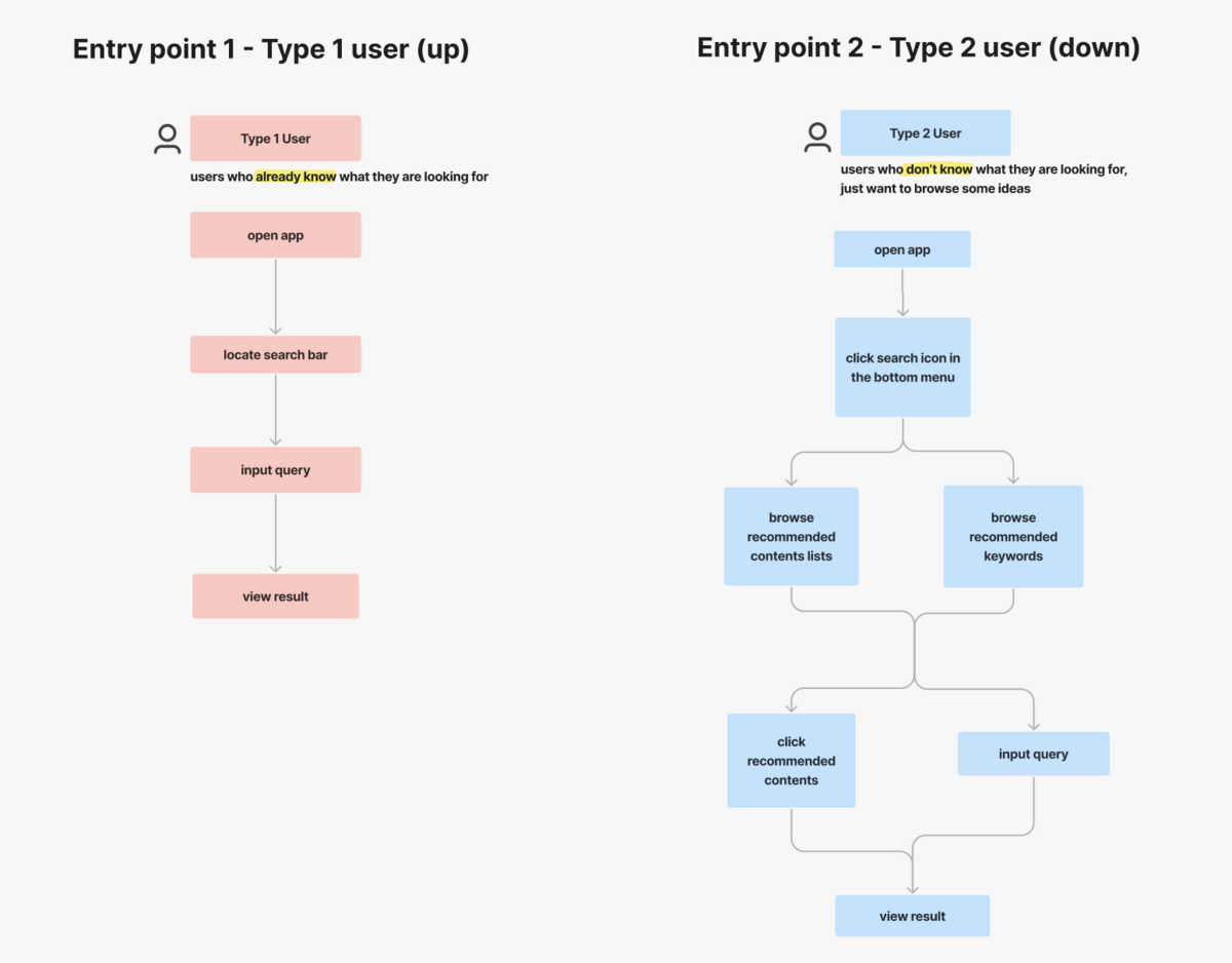
Type 2: users who don’t know what they are looking for, just want to browse some ideas (based on the ideas, they will go buy these essential ingredients, shopping after) User action: open app → Access search top feed → browse recommended keywords or content list → input query or click recommended keywords → view result
These 2 types of users' needs and requirements are different, so we want to create the best user experience that would cover both our user's needs (create 2 different entry points for different user groups). For those Kurashiru’s loyal users, they need to take 2 steps in order to reach the search bar. After the UX adjustment, they could access the search bar once they open our app, imagining you try to find a recipe after a busy day of work or taking care of kids at home every day, this small UX improvement could save our user half of the time every day.
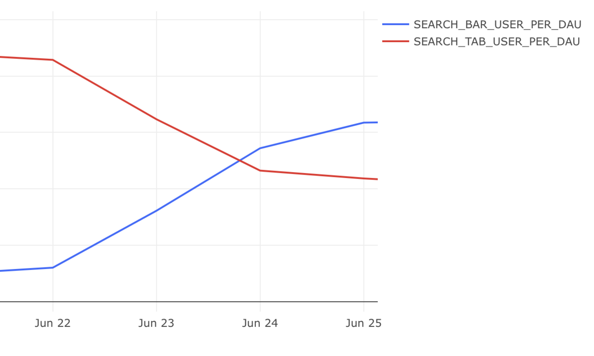
By adding the “search bar” to the home feed, after the release, the data proves that most of our users are choosing to use the “search bar” on the home feed. After a certain period, the number of users who use the “home search bar” and “search tab” are showing a stable trend.
So, here is how our team prioritise and manages our tasks by using the UX mapping method. In the end, these methods are just theories, we need to adjust how we will use them to match our team's needs.
Thank you for reading, see you next time. :)